Logo


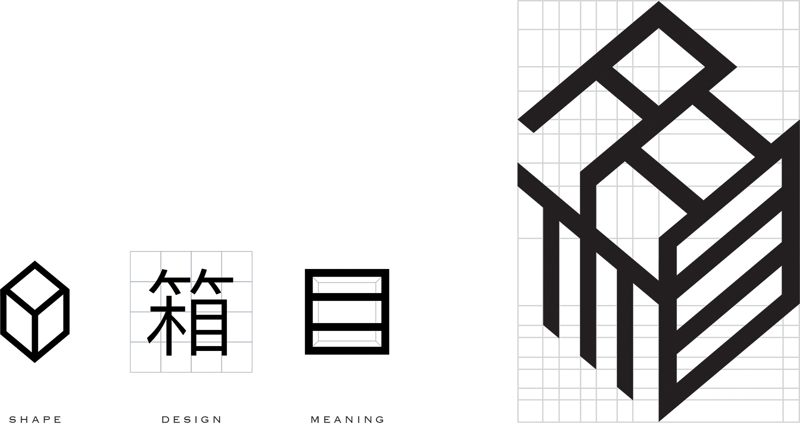
The beauty of the Chinese language comes from the way its characters have evolved over centuries: from a more pictorial representation of the thing itself, to a more abstract symbol that still carries subtle traces of its original form. Our logo has mapped that same historical transformation even further, by fusing the Chinese character 箱(i.e. box) around its very own self, to bring us back to its most tactile and true state.
This synthesis between the thing itself and its human symbol, 箱, brings new meaning to what was known simply as a box—but what is now known as Boxzes.
And not just in the logo, but in the name itself, Boxzes is spelt with a “Z” to phonetically bring out the essence of our product: for those to ‘Z’ (see) inside the box.
Naturally, a symbiotic relationship exists between the “Z” and the element within the Chinese character, “目”, meaning eye, vision or sight. No longer is the box merely for storing an object, but rather, inviting those around to peer inside, to physically and visually preserve what’s inside the box in all its timeless qualities.
